San Francisco’s Iconic Landmarks – A Personal Project
This is a personal project I have been working on for a while. It all started with a set of 49 icons that I recreated in illustrator of iconic San Francisco landmarks. From there the 49 icons spiraled into an app idea.
Click or tap on the interactive prototype to see inside the app. If you click or tap on parts that are not interactive, blue boxes will appear showing you where you can.
View the interactive prototype in a larger window here
Game of Tastes: A Game of Thrones Inspired Dinner
These are the intro and outro titles I created for one of the cafés at work. That café did a Game of Thrones theme for their end of semester dinner. These played throughout a longer video of top clips from each season of the show so far. The audio is for the purpose of this video only. On the day of the dinner, there was music selections from the show playing instead.

“The Fog of San Francisco” Website
This blog post comes a little later than it probably should but, I didn’t think about doing one back in december.
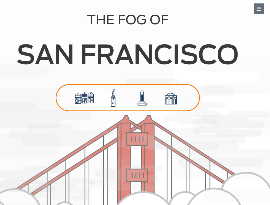
The Fog of San Francisco is a parallax website* that features four iconic neighborhoods in San Francisco. As you scroll through these four iconic neighborhoods of San Francisco you’ll be covered by fog. Along your fog filled journey you have the chance to visit each neighborhood. You’ll find a few interesting facts, how to get there, what you should do once you get there, and more.
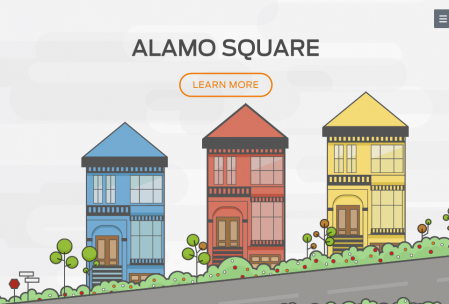
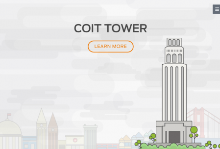
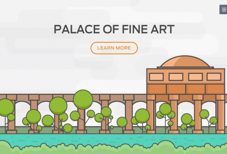
These are the neighborhoods you scroll through along your journey (starting at Alamo Square and ending at Palace of Fine Arts):
Behind all great projects, of course is an awesome team. For this project, I worked with Sundai Sun, Adam Wojewidka, and Ulrica Soenargo.
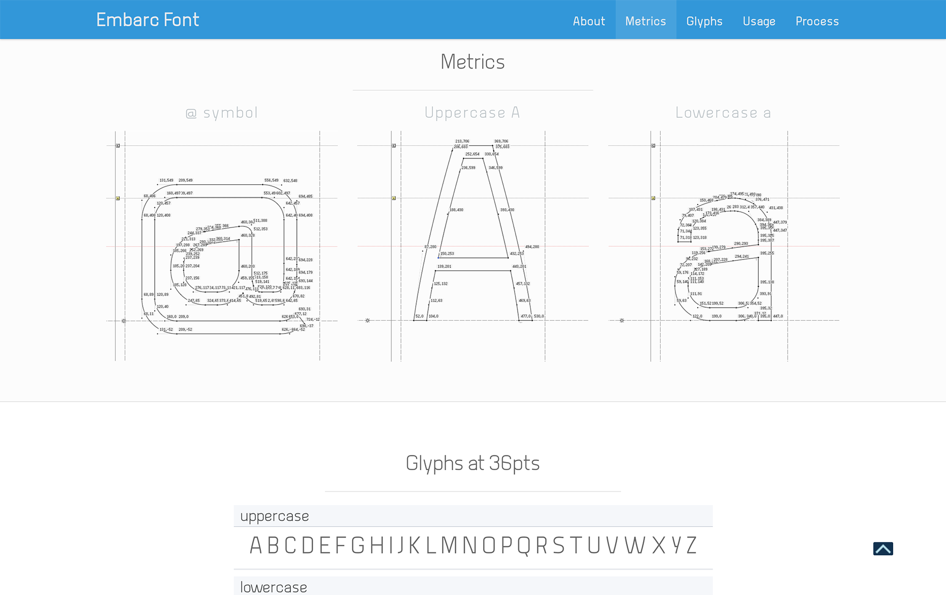
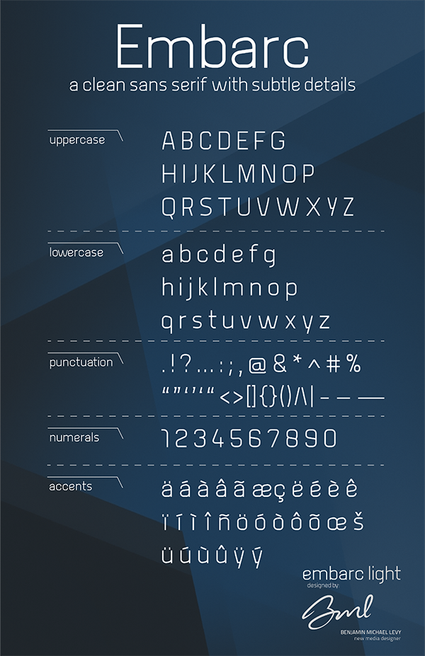
Sundai was crowned leader when it came to managing our github account and figuring out how our website would scroll. Adam was in charge of doing the modal window with a map and tying the up the lose ends. I chose the typeface used throughout the project as well as created an SF icons typeface. Though you can only see four neighborhood icons, I created 45 others(a total of 49). I made other small icons that are implemented in the navigation menu as an open/close toggle and directional arrows that guide you back from each neighborhood or tell you how to close the modal window with the map. Ulrica was in charge of doing all the beautifully detailed yet minimal style illustrations.
This is the navigation menu I created along with the icons for each of the four neighborhoods.
It was great working with my team and we made it. Thank you, team! Thank you to our teacher, Hamilton Cline and thank you Web & New Media Department at Academy of Art.
*Note: Chrome is a great browser but, “The Fog of San Francisco” may or may not play nice in older versions. If you’re experience of the fog seems a little more hazy than it was designed to be, please open “The Fog of San Francisco” in either Firefox or Safari. “Does it work in Internet Explorer” is a question that should not be asked. It will not work. Thank you!

Hornblower Website Layout Update
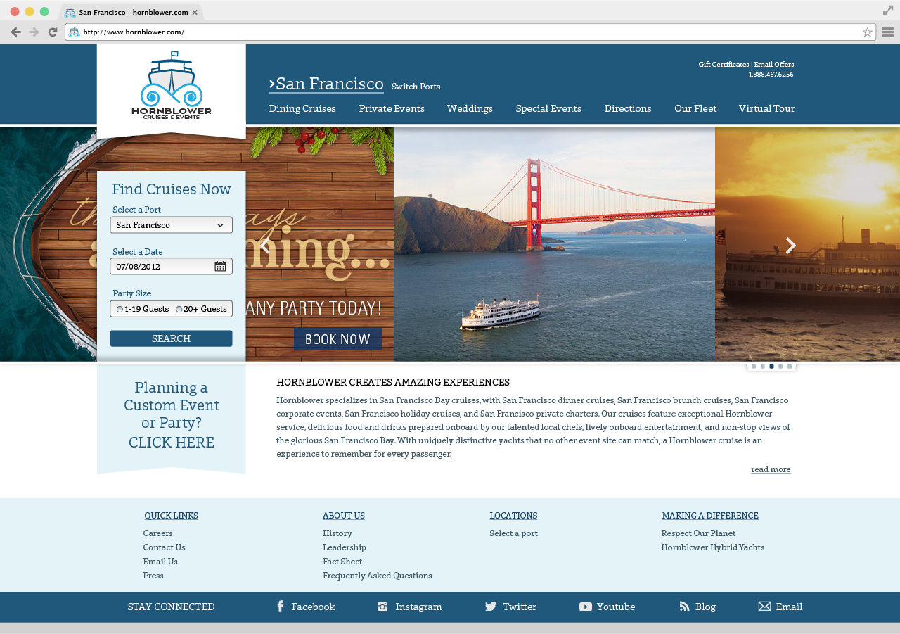
Take a look at my original website design for the Hornblower rebrand I created in the summer of 2012. At the time, I thought my design was pretty great when I finished it.
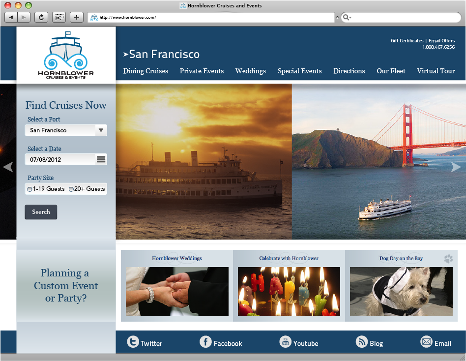
Now in my final portfolio class, I have rethought many of the choices I made for this part of the project. In the results below, my final version of the website layout, the look is polished, more refined, and cleaner. I used just one typeface choice throughout the site giving it a much more unified look. While the general structure of the website stays the same, a few simple design changes gives the site a refreshed look.
