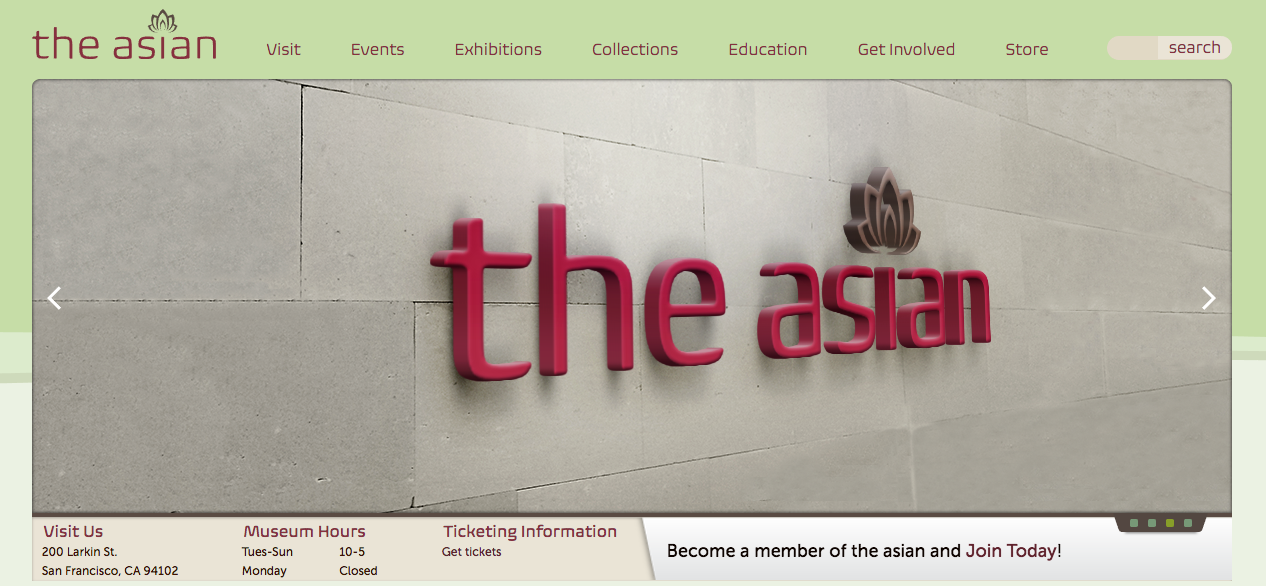
Updates on Asian Art museum website
I’ve been hard at work giving my design for the Asian Art museum website a much needed make over. For starters, my original logo design has been retired from the project. I created a completely new, clean, and stylish logo for the project. The website design has expanded from 960px wide to 1024px wide. The design layout for the top information slider has gone from displaying one large image with four different slide titles below to showing a large image but, only one title and subtitle. The use of small square dots on the lower right side as well as arrows on both sides of the slider indicate more content. The new elements are much more refined and will fit better within the overall design.


Leave a Reply